Great UX design can drive conversion rates up to 400%. That’s a headline number worth pausing on, because most business websites aren’t getting anywhere close to it. They look polished, they load (eventually), and they have a contact form somewhere near the bottom. But they aren’t built to convert. They’re built to exist.
The gap between a site that looks good and a site that actually generates leads has been widening for years. In 2026, that gap becomes a revenue problem you can’t rationalize away. At Brandleap Agency, the biggest conversion gains our web development clients see don’t come from full redesigns. They come from targeted, conversion-engineered updates applied to the right sections of the right pages. This article covers the top trends in web design for lead conversion right now, and exactly what those updates look like in practice.
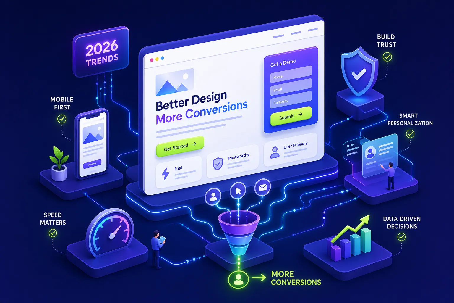
Below are five conversion levers, above-the-fold clarity, mobile-first UX, page speed, trust signals and micro-interactions, and AI-driven personalization, mapped to specific tactics and benchmarks you can test this week.
Top Trends in Web Design for Lead Conversion: Above-the-Fold Clarity
Most sites lose leads before the visitor scrolls. The above-the-fold zone is the single highest-leverage area on any landing page or homepage, and conversion-focused web design in 2026 treats it as its own discipline, not just a visual choice. For a broader look at current visual and UX directions, see this roundup of modern website design trends that inform above-the-fold best practices.
The anatomy of a high-converting hero section
A lead-ready hero section has three non-negotiables: a clear value proposition (not a tagline), one primary CTA with action-oriented copy, and a visual hierarchy that directs the eye toward that CTA. Competing messages, multiple CTAs, auto-playing videos, and navigation-heavy headers dilute attention and suppress form submissions. Every additional element above the fold competes for the click you actually want.
CTA placement, contrast, and copy: what separates clicks from ignores
Personalized CTAs convert 42% more users than generic ones, a figure consistently supported across CRO platforms including HubSpot and Unbounce. The underlying principle applies even to static pages: specificity wins. “Get My Free SEO Audit” converts better than “Submit.” “Start Generating Leads” converts better than “Learn More.” Button contrast, size, and whitespace matter too. The minimum tap target for mobile is 44×44 px, and full-width buttons consistently outperform small, centered ones on smaller screens.
What to eliminate above the fold before adding anything new
Subtraction is often more powerful than addition here. The most common above-the-fold mistakes aren’t missing elements, they’re excess ones. Slow-loading hero images, vague H1 headlines that describe the company rather than the offer, and navigation menus that compete visually with the CTA all reduce conversion. Audit this section first. Remove before you add.
Mobile-First UX: A Top Trend in Web Design for Lead Conversion
Mobile-friendly design produces 40% higher conversion rates than non-optimized sites. That’s not a design preference, it’s a lead generation strategy. Reframing mobile-first this way changes what you prioritize in the build. For a practical, hands-on perspective on mobile-first patterns and layout decisions, see this mobile-first design guide.
Single-column layouts and thumb-friendly tap targets
Design starts at 320, 375 px wide. Single-column layouts reduce cognitive load and keep the visitor moving in one direction: toward the CTA. Place the primary call-to-action in the thumb-reachable zone, the lower-center of the screen, rather than tucked in a top corner. The 44×44 px tap target benchmark applies to every interactive element, and full-width buttons eliminate mis-tap frustration entirely.
Form length and field count: the mobile lead capture benchmark
Every major CRO study points the same direction: fewer fields produce more completions. For top-of-funnel offers, 1, 2 fields (name and email) is the target. Middle-of-funnel forms can handle 3, 5 fields before friction becomes a conversion killer. High-intent, bottom-of-funnel pages (demo requests, consultations) can justify 6, 8 fields when the offer value is clear. The rule is to collect only what’s needed to qualify the lead at that specific stage, and push secondary questions to a later step using progressive disclosure.
Navigation patterns that keep mobile visitors moving forward
Collapsible menus reduce visual clutter without removing access to secondary pages. Bottom navigation works well for frequently accessed actions, research from the Nielsen Norman Group shows that placing key actions within thumb reach on mobile reduces task abandonment. The principle across all of these choices is the same: reduce friction at every tap. Every unnecessary decision point is a potential exit.
Page Speed as a Revenue Driver, Not a Technical Checkbox
Every second of page load delay reduces conversions by roughly 20% (Google/Deloitte, 2019). This is a marketing problem, not a developer problem. A slow site wastes every traffic source, paid search, organic rankings, email campaigns, because it burns the click before the page even loads.
How load time directly shrinks your lead pipeline
The data is sharp here. B2B sites that load in one second have three times the conversion rate of five-second sites. Conversion rates drop from roughly 40% at one second to 29% at three seconds, with steeper declines after that. Bounce probability rises 32% when load time increases from one to three seconds, and 90% from one to five seconds (Portent, 2019). The inflection point is around the three-second mark, that’s where visitor patience runs out and leads disappear.
Core Web Vitals to prioritize for conversion in 2026
Google’s current “good” thresholds are: LCP (Largest Contentful Paint) under 2.5 seconds, INP (Interaction to Next Paint) under 200 milliseconds, and CLS (Cumulative Layout Shift) under 0.1. Each metric maps directly to a conversion impact. LCP delays lose impatient visitors before the page renders. Poor INP makes form submissions feel broken or unresponsive, which causes abandonment. High CLS triggers layout shifts that cause accidental mis-taps on CTAs, the visitor clicks the wrong element and leaves. Sites passing all three Core Web Vitals benchmarks see 24% lower bounce rates overall. For a practical rundown of what’s changed and how to pass Core Web Vitals in 2026, read this Core Web Vitals 2026 guide.
Trust Signals and Micro-Interactions That Lower the Friction Barrier
Visitors don’t hand over their contact details to websites they don’t trust. Trust signals build credibility, and micro-interactions confirm actions and reduce anxiety. These two elements work together to lower the psychological cost of submitting a form.
Where to place social proof for maximum impact
Footer testimonials are a missed opportunity. Proximity-based social proof, placing reviews, client logos, or case study snippets near your CTAs and forms, performs significantly better than testimonials buried at the bottom of the page. According to a Wyzowl study, video testimonials and multi-format social proof can boost B2B conversions by up to 270%. One business coaching firm moved testimonials higher on its lead-gen landing page and shortened the mobile form; completed signups increased by 31% within 10 days. Placement matters as much as the social proof itself.
Form feedback, real-time validation, and microcopy that keeps users from quitting
Real-time validation that catches errors as users type removes the frustration of submitting a form and getting a wall of error messages back. Progress bars on multi-step forms let users see how close they are to finishing. Reassuring microcopy, “We’ll never spam you” placed directly below an email field, addresses the objection at the exact moment it forms. Success states matter too: a clear confirmation message or checkmark after submission closes the loop and builds trust for future interactions.
The micro-interactions with the strongest documented conversion effect
Inline autocomplete reduces input effort and keeps users moving forward. Hover affordances confirm that elements are clickable before the visitor commits to a tap. Loading indicators prevent users from clicking a submit button twice out of uncertainty. Error messages written as guidance (“Please enter a valid email address”) perform better than warnings (“Invalid input”) because they tell the user what to do next. These patterns work when they make the interface feel responsive and low-friction, not when they’re decorative animations. For more inspiration on micro-interactions and UX patterns, see this literature piece on micro-interactions in UX.
AI-Driven Personalization: Turning Website Traffic into Qualified Leads
In 2026, AI personalization for websites is accessible to businesses well below the enterprise level. This is no longer a feature reserved for brands with six-figure tech budgets, and it’s one of the top trends in web design for lead conversion this year.
Dynamic content and personalized CTAs: how it works in practice
Site-level personalization looks like this: a visitor arriving from a Google Ads campaign sees a hero headline that mirrors the ad copy. A B2B visitor identified by industry sees messaging specific to their vertical. A mobile user sees a shorter form and a tap-friendly CTA positioned for thumb reach. Cadbury’s AI video personalization campaign produced a 33.6% lift in conversions. A SaaS trial page that added an AI-triggered support prompt within the first 60 seconds saw a 24% bump in trial-to-paid conversions among its target segment. Personalization works when it removes the gap between what the visitor expects and what the page delivers.
Personalization and A/B testing tools SMBs can deploy in 2026
The main SMB-accessible platforms break down by use case. For general B2C or B2B businesses starting out, Mida is a solid entry point, free up to 100,000 monthly tracked users, a no-code visual editor, and a 15 KB script that won’t hurt page speed. For B2B companies targeting specific industries or company sizes, Mutiny handles firmographic targeting without requiring developer involvement. For businesses that want integrated A/B testing, heatmaps, and behavioral personalization in one platform, VWO offers a comprehensive combined suite. Start with one tool matched to your business model before layering in additional platforms. For quick reads on AI optimization of landing pages specifically, this article on AI landing page optimization is a useful primer.
A/B testing as a conversion discipline, not a one-time experiment
Personalization without testing is guesswork. The highest-return tests to run first are CTA copy variants, form field count, and headline alternatives. Read results only after reaching statistical significance, small sample sizes produce noise, not insights. The core habit of conversion rate optimization in 2026 is iteration: test, measure, implement the winner, then test the next variable. One well-run test per month compounds into meaningful conversion growth over a quarter.
Building a conversion-ready site from the first line of code
Most of the conversion problems covered in this article aren’t fixable with a patch. They’re structural. They exist because the site was designed to look good rather than engineered to perform. Speed, mobile structure, CTA hierarchy, and personalization readiness have to be planned at the architecture stage. Retrofitting them after launch is slower, more expensive, and rarely as effective as building them in from the start.
Why most sites underperform: they were designed, not engineered
Visual design and conversion architecture are different disciplines. A designer optimizes for aesthetics and brand consistency. A conversion-focused build optimizes for the path from visitor to lead, with page speed, mobile-first structure, and CTA placement baked into every decision. When these two goals aren’t aligned from the start, the result is a site that photographs well but doesn’t fill a pipeline.
How Brandleap’s web development team integrates SEO and conversion from day one
At Brandleap Agency, every site we build treats search performance and lead conversion as parallel goals, not competing ones. Technical SEO, Core Web Vitals compliance, mobile-first layout structure, and CTA architecture are part of the initial build, not afterthoughts added during a post-launch audit. This approach means clients don’t face a full redesign 18 months after launch because their “pretty” site isn’t generating leads. If you want a site built this way from the ground up, our web development team is the right starting point. Explore our SEO services and approach to conversion-engineered design from day one.
The short version: five levers, one test at a time
The top trends in web design for lead conversion in 2026 come down to five levers: above-the-fold clarity, mobile-first UX, page speed, trust signals and micro-interactions, and AI-driven personalization. None of them are about aesthetics. All of them are about engineering the path from visitor to lead with less friction at every step.
Here’s the action step: pick one section from this article, identify the single change with the clearest benchmark, and run that test this week. Measure the delta. A site that converts 5% better every month is a fundamentally different asset after a year than one that stayed static. For ongoing insights and tactics on conversion-centered web design and digital marketing, visit the Brandleap Agency Blog.
Businesses that want a site built for conversion from the ground up, rather than patched toward it over time, should work with a team that builds it that way by default. That’s exactly what Brandleap Agency does. The results follow.